Being able to access SharePoint on the go is a major feature with the 2010 version. Out of the box, SharePoint will automatically redirect to a mobile site when accessed from such devices. However the out of the box look and feel is very basic, but you can still add and edit list items, access files and other functions etc.
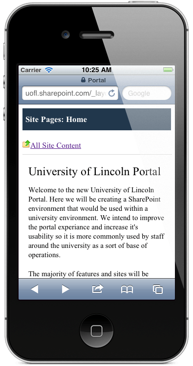
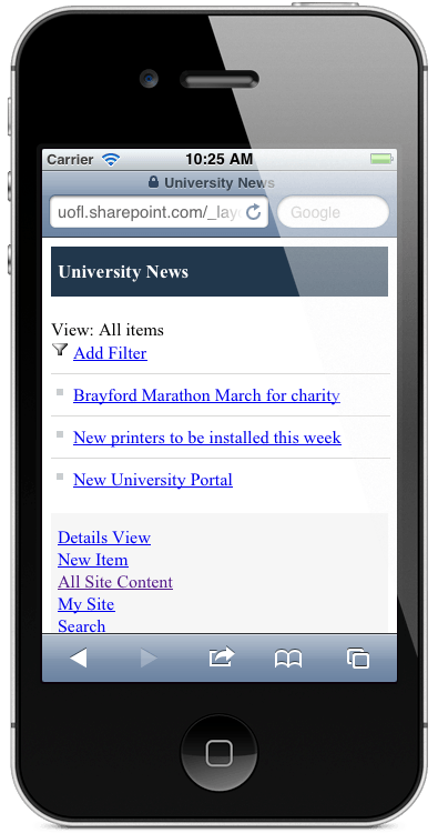
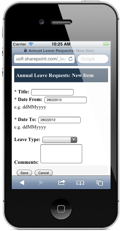
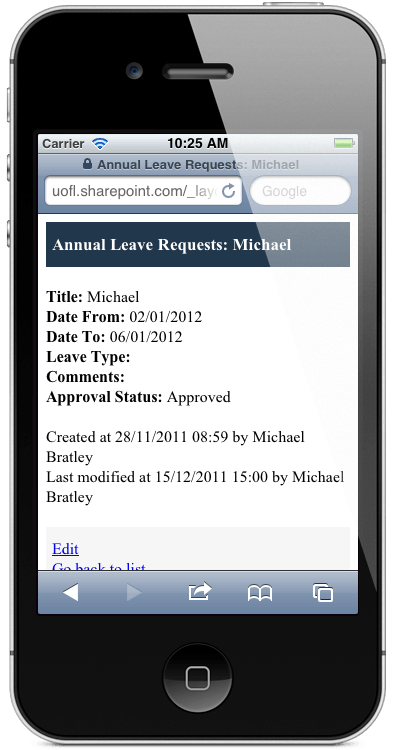
The above screenshots show some examples of how a SharePoint site looks out of the box on a mobile device to end users. The only problem with using the out of the box mobile site, is that it offers no customisation with either the master page or the css files, and therefore are stuck with the very ‘light’ looking version. After a little research it does appear that there could be some solutions to the problem.
One document expresses that you have 3 options when it comes to the mobile site of SharePoint. The first is to do nothing, the second is a mobile app strategy and the third is a wrapper strategy. The mobile app strategy would give the best experience according to the author, however with almost as good an experience as the app is the wrapper strategy. The mobile app strategy would probably by best however at this early stage it would not be easy. The wrapper strategy would offer desktop content in a mobile skin and the desktop and mobile content would be the same compared to the out of the box mobile sites which offers a ‘watered down’ version. But if the mobile site is only going to be used by internal members of staff, the out of the box site will be just as good functionality wise.
It is also worth noting that when creating custom lists, that you will also need to create a mobile adaptor for it to display correctly on the mobile site. If you do not create one, that web part will not show up on the mobile site.